Client News: Seattle mid-century modern home’s design inspired by the geometry of gems, grand views; featuring expansive, contemporary windows from Kolbe’s VistaLuxe Collection
Posted on May 11th, 2017 by Heather West
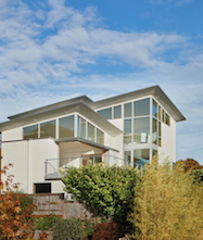 Showcasing picturesque views of city skyline and natural landscape, a Seattle couple's three-story dream home finds inspiration in the geometry of precious gemstones and of mid-century modern architecture. The house's crystalline massing and angled roof create a space that resembles an emerald-cut diamond faceted with expansive windows framing enviable vistas.
Personality Driven, Modern Design
Owners Rebecca Bridge and her husband, Evan Lundgren, are lifelong residents of the Seattle area. From a young age, Bridge learned to appreciate the region's beauty and the geology. As an adult, she became a gemologist working for a local jeweler.
With her strong connection to work and family, Bridge chose to remain in the Magnolia neighborhood where she grew up. After she and Lundgren married, they were ready to move from a condominium into a more spacious place with room to grow. They purchased a one-story with a basement, but knew that it would require extensive renovation.
To help create their dream home, they contacted Joseph McKinstry Construction Company who put them in touch with Janof Architecture. "They wanted a home designed around entertaining their extended family, who all live nearby. And it was essential to maximize their spectacular views of downtown Seattle, Mt. Baker and Mt. Rainier," says architectural firm principal, Amy Janof, AIA. "They also both really like Modernist architecture, and the clean look of classic mid-century modernism."
Bridge agrees and remembers, "In our earliest conversations, Amy asked what style of architecture we liked. I mentioned a fondness for Palm Springs' design. She replied, 'We're going to work so well together.'"
Listening and observing the couple's interests, the architect sought to connect the design style to the owners themselves. "We based the design on Rebecca's interests in gems," describes Janof. "Gemology and architecture share a sense of carefully constructed facets. How you angle and shape a gem to highlight the way it catches the light and presents its best features can be very similar to how you design a home."
"Amy was adamant about incorporating our interests and personality into our home's design," reiterates Bridge. "In addition to my focus on gemology, Amy also incorporated Evan's connection to the water with sailboat-inspired shapes. Both his grandfather and great-grandfather were ferryboat captains. Although these people are no longer with us, we still can watch the ferries from our home and think of them."
Enhancing the View, Respecting the Climate
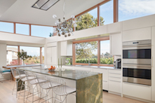 Janof and her firm have earned a reputation for designing comfortable modern homes personalized to their owners and optimized for the surrounding view. Inviting her perspective on what contemporary homes need from a window system, Kolbe Windows & Doors included Janof in the early development of its VistaLuxe Collection.
"They asked what I'd want if I could have the perfect window line for a modern house," Janof remembers. "Kolbe did an amazing job. VistaLuxe is incredible." In particular, she mentions the consistent alignment and matching sightlines on both fixed and operating windows. Large panes of glass, narrow frames and slim, unobtrusive hardware contribute to an enhanced viewing experience.
On the Bridge-Lundgren home, Janof chose Kolbe's VistaLuxe Collection windows and doors with an Accent Style exterior, where the sash is recessed from the frame to add visual depth and interest. The exteriors are finished in a clean Timberwolf gray color. Maintaining the desirable, neat, clean and consistent appearance, field-finished Vertical Grain Fir was selected on the interior for all of Kolbe's windows and doors.
"It's so nice to have the beauty of a wood window and the exterior protection of (aluminum) cladding, which we need in this climate," adds Janof. With respect to climate, Seattle has one of the strictest energy codes in the U.S. "We met the code without any issue as the windows offer a 0.30 U-value."
"From the beautiful exterior color choices, to the minimized framing on the interior, I cannot adequately express how amazing these windows are. I just don't have the words to say how wonderful they are, how much they feel like they were made especially for us," praises Bridge.
First Impressions, Creatively Reimagined
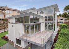 Familiar with the local climate and neighborhood culture, Bridge remembers her first impressions of the property where she and Lundgren now live. "I used to ride my bike past it as a kid and think it was rather creepy: The lot was overgrown, the house was mustard yellow and the whole thing was surrounded by an ugly fence. When we visited it with our realtor, it seemed little had changed. As the area around it had been developed, this had not kept up with the times," she says.
Bridge elaborates, "The interior décor wasn't much better. As I explored the lower level with our realtor, I was surprised to hear Evan shout down from the upstairs, 'We have to buy this place!'" Joining him upstairs, she was stunned by the panoramic scope. "It was the same view I had growing up – the water, the mountains, the skyline – almost identical to my memories." Preserving these views, their lot has deeded view protection, meaning that no new structures may be built to block their view.
Bridge continues, "When Amy asked us how we wanted to make the most of these views. I told her, 'I completely trust you to recommend what will work best for our space and maximize these views without going overboard in cost.' I really believe in trusting the people who know what they're doing and giving them the freedom of creativity. Amy came back with an approach that knocked it out of the park. It was fantastic."
Even with challenges, such as structural and foundation issues, Janof and the owners remained committed to the design process and vision. "With both gems and architecture, there's a geometric rhythm at work," observes Janof. "Looking at the existing foundation, we took the shape that we were given – a square – and played with its structure to guide our plan."
Eventually, the plan took form as five 20-by-20-foot squares atop the basement. Each floor is comprised of two squares plus a grand living room positioned at the corner to offer some of the home's most impressive views. "The living room corner seems to hang in space," notes Janof. "It has enormous custom-fabricated steel beams supporting it, from which the windows and framing are suspended. It's often what we don't see that makes the final design such an elegant success."
Visionary Concept, Precise Construction
 Joseph McKinstry Construction Company worked closely with Janof to ensure the 4,620-square-foot home's design was properly implemented. "Amy and I have worked together for quite a few years on quite a few projects," notes Joseph McKinstry, company president. "She always comes up with something out of the box. For the Bridge home, she showed us something completely different than the home that previously had been on that site and the new owners were delighted."
McKinstry continues, "The resulting home is spectacular, and highly complex. Our superintendent, Joe Berndsen, is terrific at complex situations like these. And this one was a real head-scratcher at times with windows angled all over the place. It was a fun to bring it from shop drawings to reality."
"Amy and the 'Joes,' as we called them, did an amazing job," interjects Bridge. "I feel we were in the right place at the right time with the right people to make this project happen the right way."
Helping verify the steps between concept and construction, every beam, joist and stud in the Bridge home was modeled in 3-D. "This helped us resolve any potential conflicts before they were in the field," Janof explains.
"Thankfully, this was perfect," adds McKinstry. "The Kolbe windows showed up, fit and worked the way we expected. It went very well."
Janof agrees with McKinstry: "It was a perfect order. We didn't have any ill-fitting windows. Nothing had to be tweaked. There were no callbacks. It was exactly as we wanted."
Finished on schedule in Spring 2016, Janof also is quick to credit the contributions of Kolbe's team and its local distributor Classic Window Products' Mike Cler. "Kolbe is a joy to deal with. Their customer service is great and they helped me figure it all out. Mike was instrumental in making sure everything works the way it should."
Contemporary Look, Customized Expression
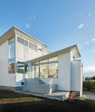 "Anything that Amy dreams up, I give her options to figure what's possible," says Cler, who has worked with Janof on other Seattle projects. "She knew what she wanted on the Bridge house and we started early in the process together. It really was the angles that drove this house design and taking advantage of the views. I helped coordinate with the contractor to implement her vision and assist in overcoming challenges."
He elaborates, "Amy and all the architects I know love VistaLuxe because of how square it is, how narrow the sightlines are and how large the units can be. There's a lot you can do with these products and keep a nice, clean, matched look."
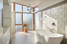
While the living room's corner windows are the most complex, the windows in the master bedroom and bath are the most massive. "These are huge units – too big to have them mulled together as single piece. Kolbe helped minimize the necessary connections, keeping the jambs as small as possible," Janof emphasizes.
To maintain Janof's signature aesthetic, Cler says, "The sheetrock wraps over the jambs to keep the modern look. We use all direct set units except where operable units are designated. The bedroom looks like a whole window wall, but actually is made of 14 separate window units running South to East. The largest of these are seven 6-by-12 foot units, topped with seven 6-by-4-foot trapezoid windows."
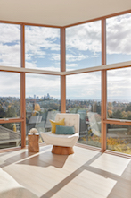 Throughout the home, Janof says, "The windows go right up to the ceiling plane. The glass is within a 1/4 inch of the roofline. The roofline itself is tilted on the diagonal, sloping corner to corner at 15 degrees."
"We really did everything we could to give it a clean look and expansive views," reiterates Janof.
After most of the windows were installed, Bridge admits that she initially had mixed feelings walking through the space. "I felt a little like I was in a fishbowl and worried that there were too many windows. I thought maybe we should cover them. I even went so far as to get measurements for drapes and blinds. But I was wrong; after we moved in I realized I didn't want to cover them. The whole point is to see out of them. The windows capture views in every direction of the house. No matter where you look, there's something beautiful to see."
**
Bridge-Lundgren Residence; 3705 W. Barrett Street, Seattle, WA 98199
Owners: Rebecca Bridge and Evan Lundgren
* Architect: Janof Architecture; Seattle; www.janofarchitecture.com
* General contractor: Joseph McKinstry Construction Company; Seattle; www.jmcc.com
* Windows and doors – distributor: Classic Window Products; Redmond, Washington; www.classicwindowproducts.com
* Windows and doors – manufacturer: Kolbe Windows & Doors; Wausau, Wisconsin; www.kolbewindows.com
Cost withheld at owners' request.
What began in 1946 as a two-brother team has grown into an internationally respected manufacturing company. Kolbe Windows & Doors is one of the nation’s leading manufacturers of windows and doors for residential and commercial markets. After 70 years, Kolbe products are best known for superior quality, custom craftsmanship, attention to detail, as well as innovative and unique designs.
###
Filed under: Kolbe Windows & Doors, Projects
